A better first impression. A clearer path to a customer.
Your website helps someone decide whether you can solve their problem. Design, speed and useful information all play a part. Here is what the evidence can — and cannot — tell us.
Research and editorial analysis by Frontier · September 12, 2026
People start judging before they start reading.
In controlled studies, people formed consistent judgments about a homepage’s visual appeal after exposures as brief as 50 milliseconds. That is a finding about visual impressions, not proof of a particular sales increase. Lindgaard et al., 2006
Later experiments found that simpler, more familiar page structures tended to receive better aesthetic ratings. For a local business, our interpretation is practical: make the service, location and next step easy to recognize. Tuch et al., 2012
Neither study compared “AI websites” with human-made websites. The result on the screen matters more than the tool used to create it.
Three approaches.
One fictional business.
Illustrations of common design choices, not screenshots of competitors or a conversion experiment.
Outdated layout
Competing information and a buried next step make the visitor do the sorting.
Generic AI styling
A fashionable surface can still say little about the actual service or location.
Professional, useful design
A recognizable business, clear service and location, and a specific action.
These are purpose-built fictional illustrations. No category has an assigned conversion rate. Professional work can use AI; a dated-looking site can still serve its users well.
Speed can change
what visitors do.
One documented field experiment, with its limits kept in view.
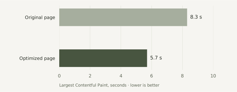
Vodafone reported a 50/50 A/B test of two visually and functionally identical landing pages. The optimized version loaded its main content faster and produced more sales and leads. This was a telecom campaign, not a test of local-service redesigns. Read the 2021 case study
Main content loading time

Reported business outcomes

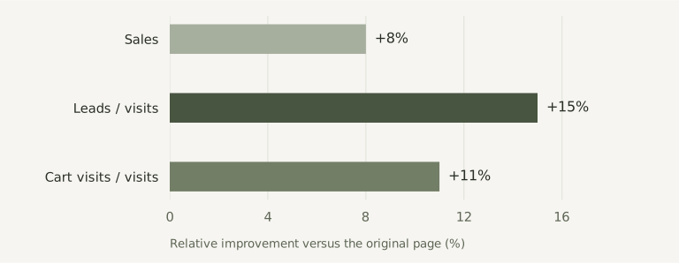
Source: Vodafone case study published by Google on web.dev, March 17, 2021. Charts recreated by Frontier from the reported figures. The source is licensed CC BY 4.0. This is a company-reported experiment, not an independent peer-reviewed trial. We do not predict the same gains for another business.
SEO & AI search ready.
Help customers find the right information, whether they search for a service or ask a question. The foundations are part of your build.
- Useful answers. Approved services, location and contact details written clearly on the page.
- A sound structure. Descriptive page titles, readable links, image descriptions and layouts checked on phones.
- Prepared for launch. Canonical URL and crawl settings for the approved domain, with local-business structured data supported where the facts are verified.
Google’s AI Overviews and AI Mode use the same SEO fundamentals as Search. Supporting links must already be indexed and eligible for a search snippet; no special AI file or schema is required. Google’s AI search guidance
Search-ready does not guarantee indexing, rankings or AI recommendations. Private previews stay out of search; the approved public site needs to allow crawling and indexing. Google Search Essentials
Measure the result that matters.
For a service business, look at qualified inquiries and booked jobs as well as visits. A phone-link click is not a completed call; a form submission is not automatically a paying customer.
With appropriate privacy controls, compare comparable periods or run a controlled test. Account for seasonality, traffic sources and advertising changes. A prettier website is only part of the customer journey.
See what our redesign includes